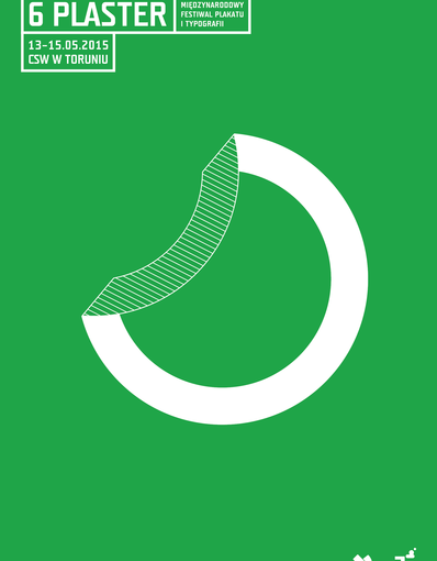
The sixth edition of the PLASTER Festival will see the struggle between daring, boycotting and risky approaches to design and others which are more traditional, cautious and tried-and-trusted. One can observe a certain correspondence between the visions of mature artists, stable and aesthetic, and the projects of younger defiant designers who represent artistic schools.
Designers from Portugal and Poland, but also from around the globe (the TDC exhibition), present their work with a particular focus on typography. Posters, spatial compositions, visual identity, letter design, manual artworks, digital and 3-D graphics: all of these make it possible to take a broader view on the matters of design in its present shape.
The global networks undoubtedly blur the local differences and predominant design trends between particular countries. The inspirations are wide-ranging, generally accessible and convergent.
Krzysztof Białowicz
/ FESTIVAL PROGRAMME
12.05 / Tuesday
10.00–14.00
15.00–18.00
Design workshops / CoCA, LabSen
Paulo Freitas
13.05 / Wednesday
10.00–14.00
15.00–18.00
Design workshops / CoCA, LabSen
Luisa Barreto
19.00
Opening ceremony
Exhibitions vernissage:
Play This Game – typographic outdoor exhibition of young artists from Portugal / Bulwar Sztuki, CoCA
Sebastian Kubica – poster exhibition / CoCA ground floor
Poster exhibition: works by students from the Szczecin Academy of Art / LabSen, CoCA
Portuguese contemporary graphic design / CoCA terrace
Type Directors Club exhibition – 2014 Annual Awards / CoCA third floor
20.00
Sebastian Kubica’s lecture / Cinema Centrum, CoCA
21.00
Live act concert
BLOKI + VJ PANNAULA / LabSen, CoCA
14.05 / Thursday
10.00–14.00
15.00–18.00
Design workshops / CoCA, LabSen
Dino dos Santos
19.00
Slow and Disillusioned – ASP Łódź, accompanying exhibition / and
multimedia show by students of the Department of Intermedia Art, NCU
Galeria S, Department of Intermedia Art, NCU, Mickiewicza 121
15.05 / Friday
11.00 – 17.00
Conference:
Fast and furious – young, unsubmissive graphic design from Poland and Portugal / Cinema Centrum, CoCA
Speakers:
Luisa Barreto, Paulo Freitas, Krzysztof Kochnowicz, Polkadot, Dino dos Santos, Jorge Silva, Syfon Studio
EXHIBITIONS
/ Play this game – a typographic outdoor exhibition of young artists from Portugal
Design education in Portugal has a short history: it was not until after the 1974 revolution that it became a common practice among aspiring designers to take formal training in design. Previously, there had been only two schools in Lisbon which offered classes in design, but the investments in higher education encouraged other institutions to follow suit – the ESAD.CR is one of them.
Since 1989, ESAD.CR has been teaching courses in fine arts, various aspects of design and entertainment. The variety of expertise, the interactions of the courses on offer and the location of the school in Caldas da Rainha, a city 80 kilometres north of the capital, have a great impact on the unique way of designing taught and practiced at school. The two degree courses offered, the Bachelor of Graphic Design and Multimedia and the Master in Graphic Design, are unique in Portugal in that they place a particular emphasis on typography: for years they were the only graphic design courses in the country that included extensive typographic training.
The PLASTER exhibition of ESAD.CR presents works by students and graduates of the school, which illustrate the results of the investment in training. They accepted the challenge to „play the game” and make posters showing their fonts. Not all posters present original fonts: some of them offer variations on well-known typographical themes. These include the drafts by Bruno Reis Santos, Magdalene Bastos or Gonçalo Fialho.
/ Slow and disillusioned
We are neither fast nor furious: we are slow and discouraged. We like ordinary things and have no wish to take part in barricade fighting. It is by means of cherishing the everyday life that we voice our discontent. The idea is to live with no rush: celebrate breakfasts, meet friends, work more slowly and make sure that this work is valuable and stems from our favourite aesthetic principles. While deciding to become professional designers we had little clue of what lied in store for us. It was challenging to see that not everyone can appreciate the beauty of a letter and that to some people getting things cheap and quick was all that mattered. We designed for the sheer pleasure of it and played with various sorts of aesthetics: fairly often with the fast and furious ones. We enjoyed the liberty of creating typographical spaces, all while staying in our cosy flats, having little care for their potential market appeal. The market, however (very sadly), is a tough reality and there is a sense of poignancy in facing it. We wish to showcase ourselves, a bunch of young designers who are never in a hurry, even though at times we take delight in chaos. Our exhibition will present a collective infographic which will explain our way of designing and demonstrate why we are interested in it. The exhibition will show our aesthetic approaches, the freedom to act and the moments when there are no objections. It is our intention to take hold of the whole gallery space. We also plan to prepare a fanzine containing examples of our collective graphic work.
/ Footprint
The success of the Polish School of Posters is a manifest sign of the recognition received by Poland’s visual artists. As every important trend it has its disciples, continuators and, as some argue, ‘posthumous’ followers. The work of Sebastian Kubica, unchangeably young (but how?), evinces his fascination with that phenomenon. It proved to be a rich source of inspiration for the inquisitive mind of this artist who marks his own presence by means of posters, graphics and other forms of graphic design. The title of this exhibition – Footprint – seems to convey the full extent of Kubica’s expressive style, characterized by controlled energy. In the space of his works, he leaves a potent signal to the viewer – and disappears. What remains is a synthetic form which comments on contemporary topics and demonstrates surprising lyrical value, perspicacity and humour.
Wojciech Majewski
/ Poster exhibition: works by students from the Szczecin Academy of Art
The exhibition presents the works by students from the Szczecin Academy of Art (Faculty of Visual Arts) who got together to form the KOŁO (‘The Circle’) Society. It came into being in 2014 on the initiative of young apprentices in the field of design and Tomasz Świtalski who supervises the work of the group together with Magdalena Januszkiewicz. The KOŁO gathers students, alumni and lecturers of the Academy who work in graphic design and organize workshops, exhibitions, panel discussions and field trips. The group members co-operate so as to make their impact on the visual aspects of their environment: they design visual identity for musical and artistic events organized by the students of the Academy and work with the Gallery in Aleja Fontann in Szczecin. Winners of several international and country-wide design competitions, they took part in two exhibitions: one in the Gallery in Aleja Fontann (Świeża Krew – ‘New Blood’) and the other during the Record Store Day in the Off Marina.
The following participants present their work at the PLASTER: Damian Antolak, Magdalena Chojnowska, Piotr Depta, Kaja Kleśta, Łukasz Szpatowicz, Zuzanna Waligórska and Hanna Wysocka. Their posters have been produced as self editions or originated in the workshops of Academy professors: Lex Drewinski, Leszek Żebrowski, Grzegorz Marszałek, Michał Kacperczyk and Adam Klasa.
/ Contemporary Portuguese Graphic Design
The exhibition presents a collection of works which are emphatically diverse and attributable to a number of disciplines, all having to do with design. The modern typography by Dino dos Santos, condensed in his poster-like vertical compositions, is a good match for the works by Paulo Freitas, a young artist from Lisbon, who presents highly individualized, ‘typographying’ editorial graphics. The spatial experiments of the studio R2, which undoubtedly can be viewed in parallel to the work of the Austrian visionary Stefan Sagmeister, illustrate the urge to transgress the spatial and material limits of graphic design. A similar approach (albeit with a slight classical feel) one can sense in the works by the studio FBA of Coimbra: their spatial arrangements related to gallery events and their modern visual identity designs communicate in an efficient and effortless manner. Three designers from Lisbon, known as the Atelier Maga, present their incredibly energetic projects which partly stay in line with tradition (especially the aesthetics of the 1970’s), but also engage in formal and typographical experiments: their distinctive trademarks are the distorted colourful shapes, an eclectic view on typography and a faint tinge of constructivism. Finally, the studio Letra and their conceptual experiments will illustrate their philosophical approach to the very process of designing, which can be observed in the raw and manual compositions by Bráulio Amado and in the lively variations on classical typography by João Neves.
Krzysztof Białowicz
/ Type Directors Club Exhibition – 2014 Annual Awards
The exhibition presents selected projects which received the awards of the 60th international type competition organized by the Type Directors Club.
The TDC is an association established in 1946 whose aim is to promote excellence and high quality standards in graphic design. Every year, the organization holds two competitions: one for the best use of typography in graphic design and the other for the best typeface design. The prizes are awarded to designers and leaders in the field: to the paragons of the profession and artistic directors at publishing houses.
The versatility of the projects, which come from many artists from around the globe, is extraordinary: straightforward and literal approaches mingle with the use of metaphor, humour and irony; purely typographical designs go together with others that include figurative elements and apart from ones based on the graphic contrast of black and white one can also find designs that make use of colour.
The collection of the prize-winning works forms was donated by the TDC to the Polish-Japanese Academy of Information Technology in Warsaw, courtesy of which we are able to present them at CoCA during the PLASTER Festival.
CONFERENCE: THE FAST AND FURIOUS
One of the greatest values of art (the art of graphic design in particular) is perhaps the coexistence of tradition and avant-garde. The firmly established notions meet the inquisitive and rebellious approaches. It is the borderland of these two worlds that generates the highest tension, which leads to unpredictable, often stunning combinations.
The conference aims to discuss the present state of the young generation of designers in Poland and Portugal, not only in the sense of their frame of mind, inspirations and attitudes towards the establishment, but also with reference to their place on the market, professional goals and plans for the future.
For the most part, the speakers will be mature artists, pedagogues and owners of prosperous advertisement studios: well-experienced designers who cooperate with the ‘young blood’ and observe attentively the peripheral and subversive tendencies in graphic design.
/ Paulo Freitas (Flatland Design)

Born in Maputo (Mozambique) in 1976, Paulo Freitas, a Portuguese graphic designer, graduated from the Fine Arts Faculty of Lisbon University. In 2005 he co-founded the Flatland Design Atelier where he presently conducts his regular activity. He is also a teacher at ETIC, the School of Technologies, Innovation and Creation, in Lisbon. Apart from various works published in different books dedicated to design, Flatland Design’s three projects have recently been selected for the Best Portuguese Book Designs 2010–2013. Paulo Freitas coordinates and participates regularly in different collaborative projects, including The Proposal Series – a set of proposals experimenting with the content and form of the book, from the perspective of independent production. He was also responsible for the project Portugal 2011 Ano Nacional da Crise (2011–2012) [Portugal 2011 National Year of the Crisis], where he participated as coauthor, coordinator and designer. Presently Paulo Freitas lives and works in Lisbon.
/ Jorge Silva

A graphic designer, illustrator, curator and lecturer, Jorge Silva specializes in editorial design. In 1978–2003 he worked as the artistic director of the daily newspaper Combate, where he began his long-term career as a press cartoonist. His illustrations were published also in other newspapers and magazines such as O Independente, Expresso and O Jornal. In 2001, he founded the design studio Silvadesigners, which focuses on cultural branding, especially with reference to Lisbon: the ‘sardines’ designed by the studio became an element of the visual identity of a number of events organized in the capital. His blog, almanaquesilva.wordpress.com, is dedicated to the history of the Portuguese school of illustration.
/ Krzysztof Kochnowicz

Born in 1955, he graduated from the State High School of Visual Arts in Poznań (today: University of Arts), the Faculty of Interior Architecture and Design. He is currently a professor at the same university, the head of the Letter Design Department and, since 2008, the dean of the Faculty of Graphic Arts and Visual Communication. His work focuses on typography. He has also prepared numerous set designs for TV programmes prepared for Polish Television in its studio in Poznań and for theatre.
/ Dino dos Santos

The founder of DSType, he graduated in Graphic Design and has a Master’s in Multimedia Arts. He has designed typefaces for clients like “The New York Times Magazine”, “Le Figaro” as well as “Stuff and Electronic Arts”. He received the Certificate of Excellence in Type Design from the Type Directors Club of New York and the Creative Review Type Design Awards. DSType has featured in several magazines, including “Eye”, “Computer Arts”, “Page” and “Graphic” as well as in books, such as “1000 Fonts”, “TDC Annual 29”, “Typography” and “Fraktur mon Amour”. DSType’s work was selected for the „Schrift in Form” exhibition at the Klingspor-Museum in Offenbach, Germany.
/ Luisa Pires Barreto

Born in Mozambique, she studied Fine Arts in Lisbon, but in 1992 became a graphic designer and worked in the Henrique Cayatte Studio until 2002, when she became a freelance designer. Since 1998, she has been a teacher of Graphic Design and Multimedia Design, specialising in the subjects of Projects Graphic Design and Information Design. She has a PhD from the Polytechnic University of Valencia, with the subject of “typography and sign systems”. Coordinator of the Graphic Design master’s degree course at ESAD.CR.
/ Polkadot

The professional graphic studio Polkadot was set up in 2008 by Hania Niemierowicz and Ola Woźniak. Hania Niemierowicz graduated from the Łódź Academy of Fine Arts having won two scholarships: one at the Royal Danish Academy of Fine Arts in Copenhagen and the Bergen Academy of Art and Design (Norway). Ola Woźniak, apart from her degree in art, received an MA in cultural anthropology. The studio designs visual identity, communication and publication materials.
/ Syfon Studio

The Syfon Studio, the interdisciplinary design studio of Filip Tofil and Urszula Janowska, is located in Warsaw: both artists graduated from the Warsaw Academy of Fine Arts in 2011. In the course of their study they also resided in Paris where they took classes at the École Nationale Supérieure des Arts Décoratifs. They define the scope of their work as visual interaction and create applied graphic designs: their artistic and community projects employ the language of contemporary design. They have been awarded a number of prizes and distinctions. Examples of some of their work make part of the collections of the MAK (The Austrian Museum of Applied Arts / Contemporary Art in Vienna) and the National Museum in Poznań (The Poster and Design Gallery).
Tags: festival, plaster, typography
 The Institution is funded from the budget of Toruń Municipality
